The Brief
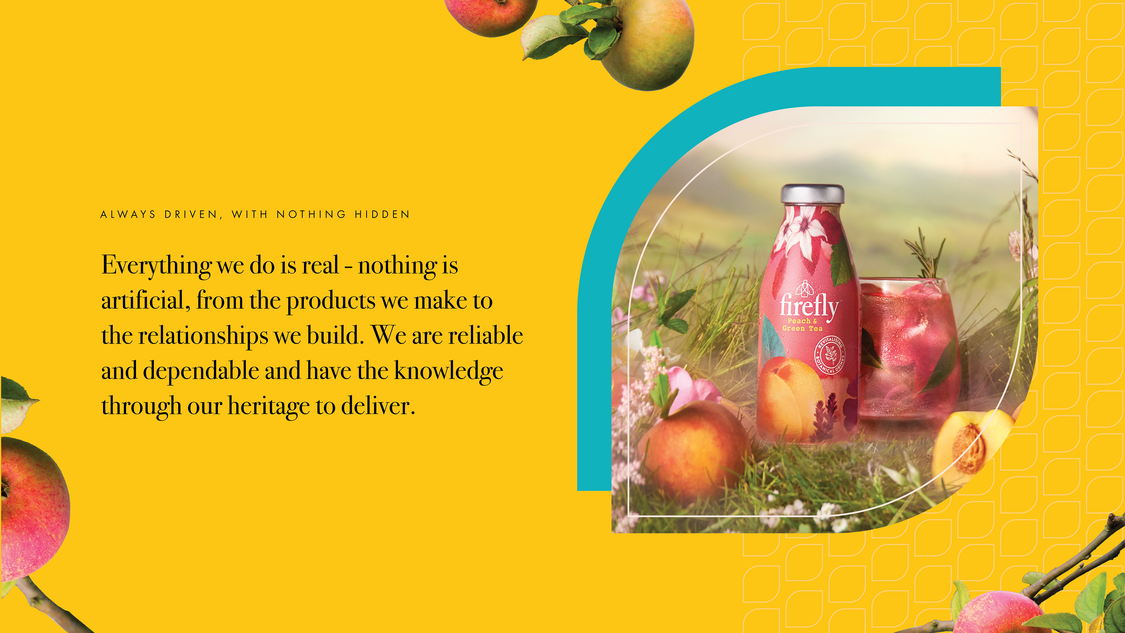
Purity Soft Drinks, a company with a rich heritage in crafting quality beverages, underwent a rebrand to better reflect its commitment to authenticity, natural ingredients, and sustainability. The goal was to create a fresh, modern identity while preserving the brand’s legacy and core values.
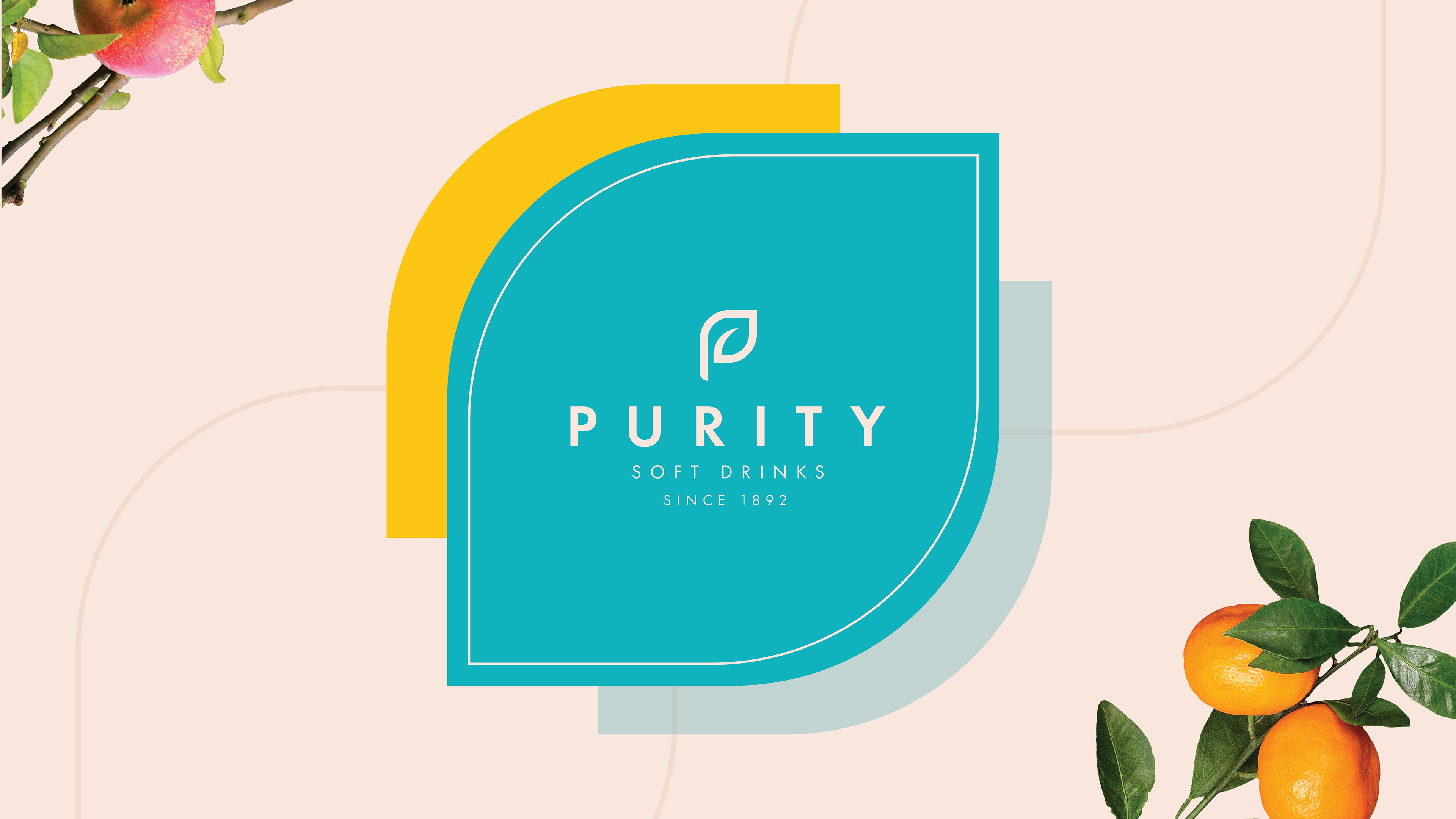
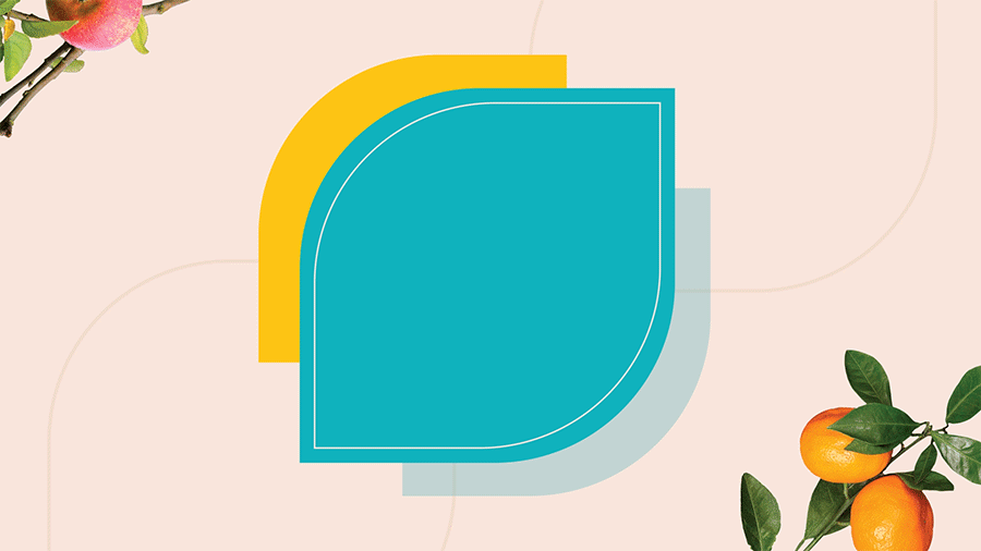
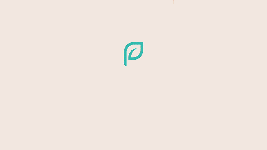
The new brand mark encapsulates Purity’s authenticity and product quality while reinforcing its natural ethos. A custom-designed logo integrates a ‘P’ and ‘D’ for Purity Drinks, incorporating a leaf shape to highlight its sustainable approach.
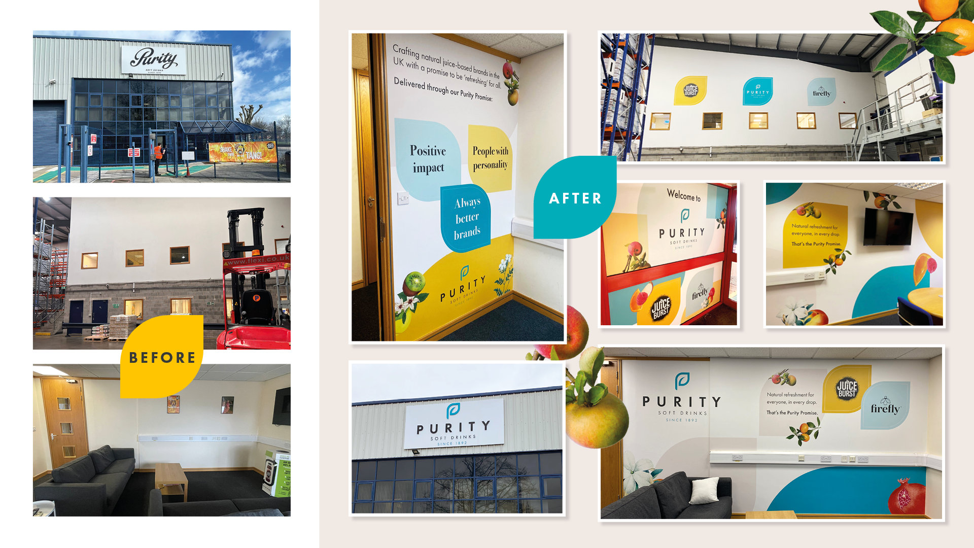
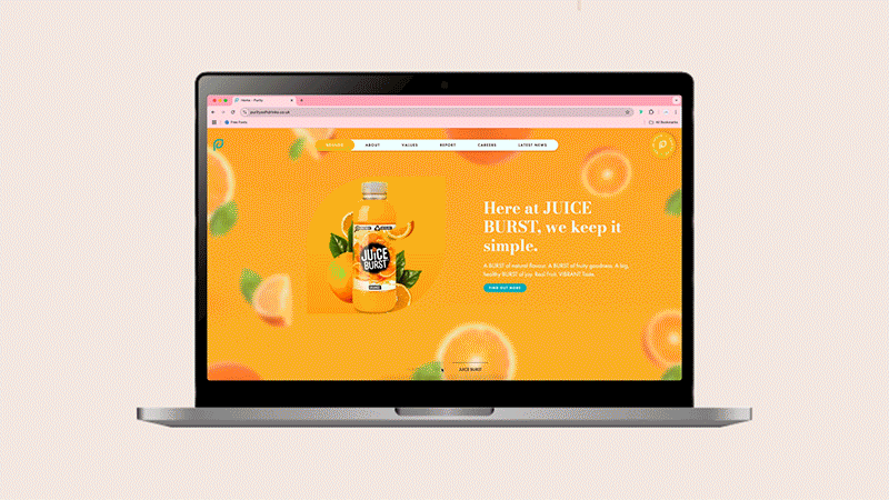
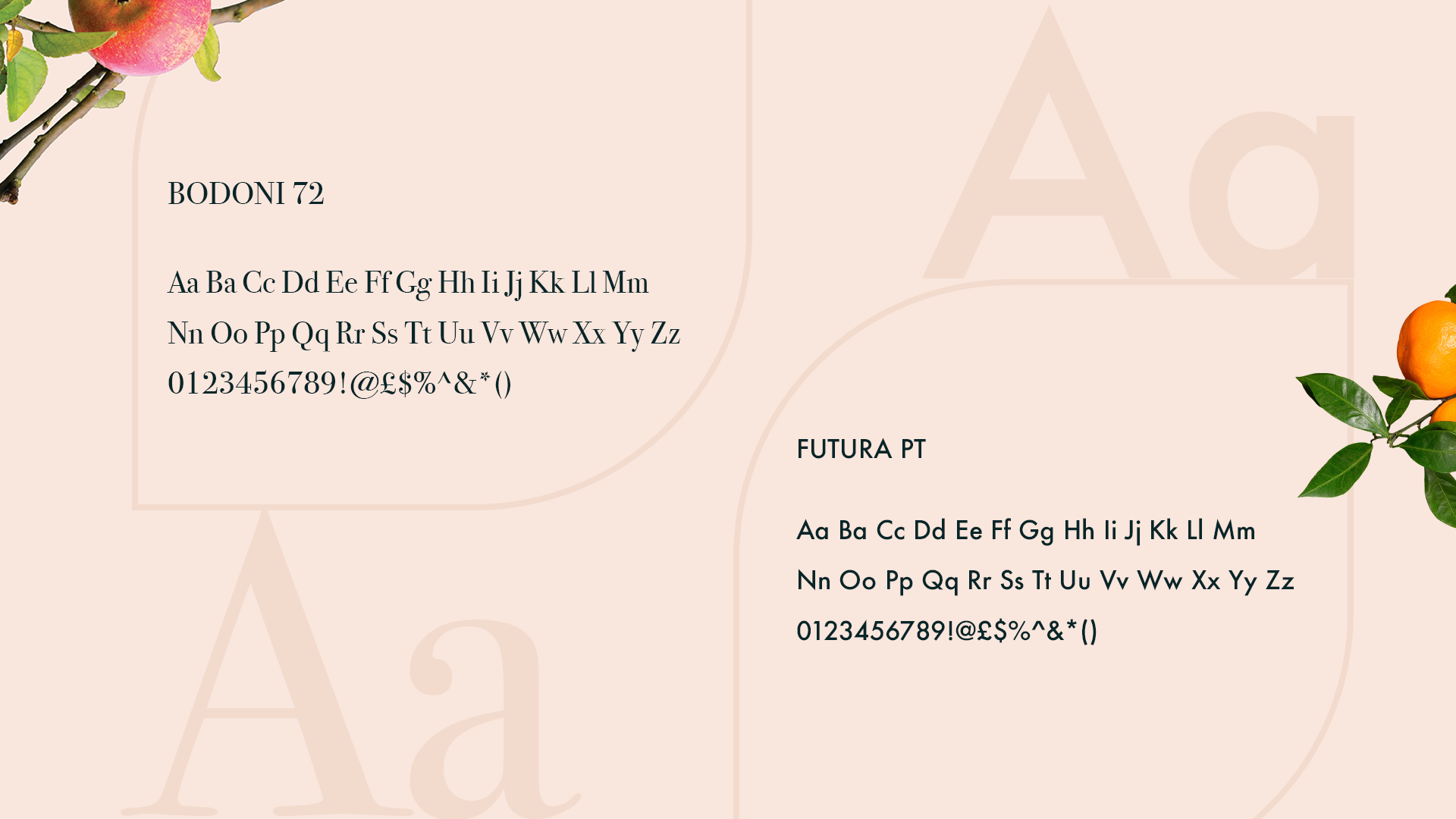
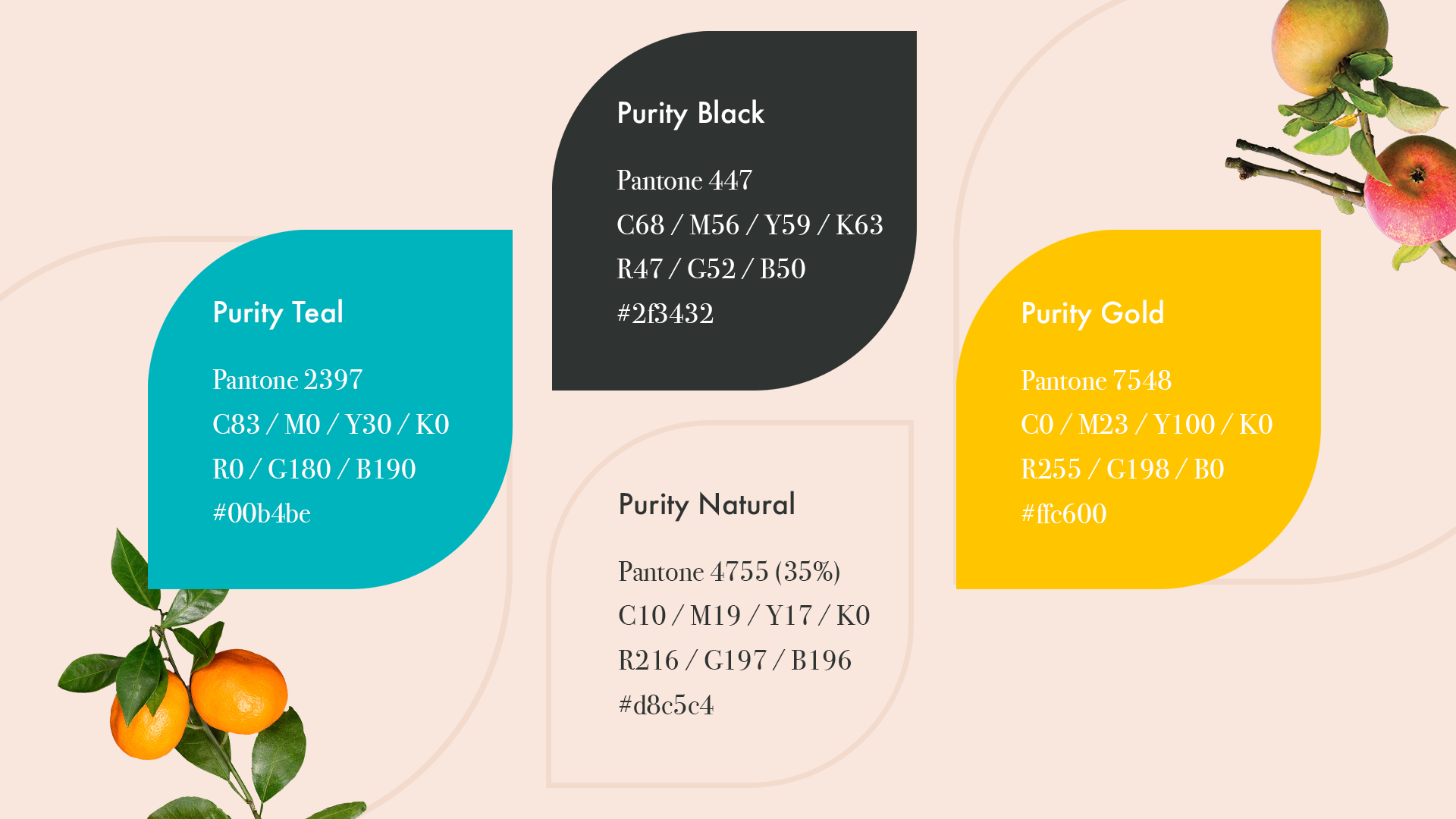
The typography features a classic serif typeface, balanced by a clean sans-serif to establish a harmony between timeless and forward-thinking. A natural colour palette, accented with lighter blue and yellow tones, aligns with the industry while maintaining a clean, contemporary aesthetic.