Deliverables
Creative rationale
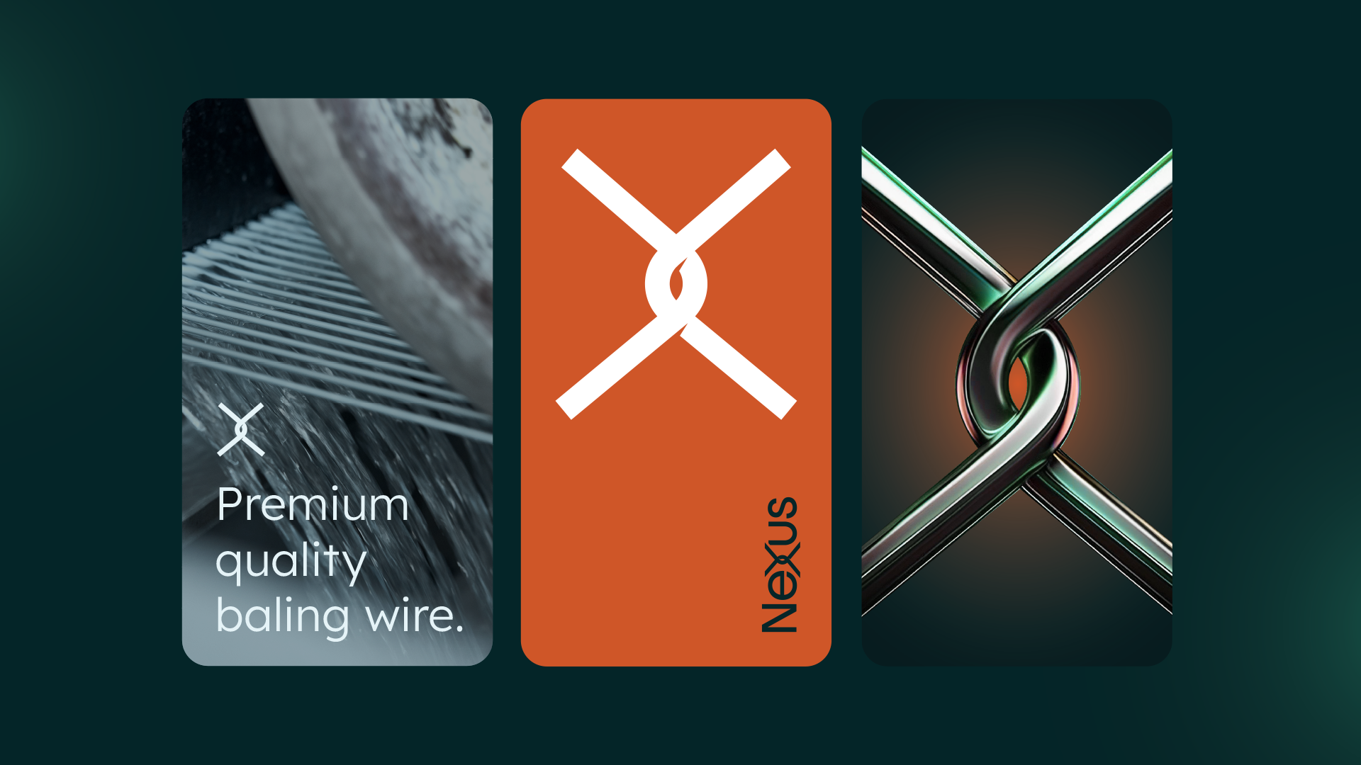
Logo
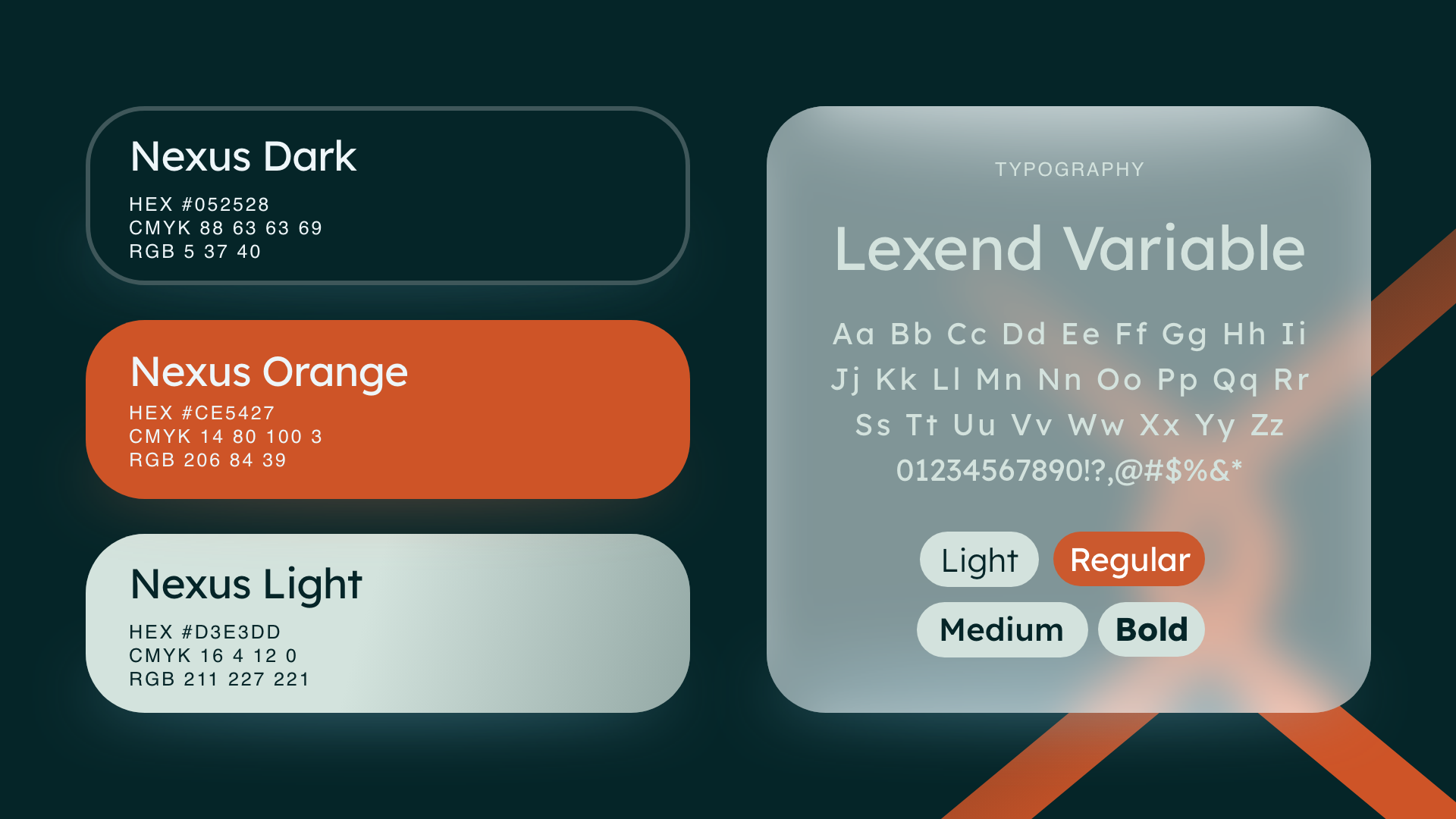
Brand Colours
Brand Fonts
Supporting mood board
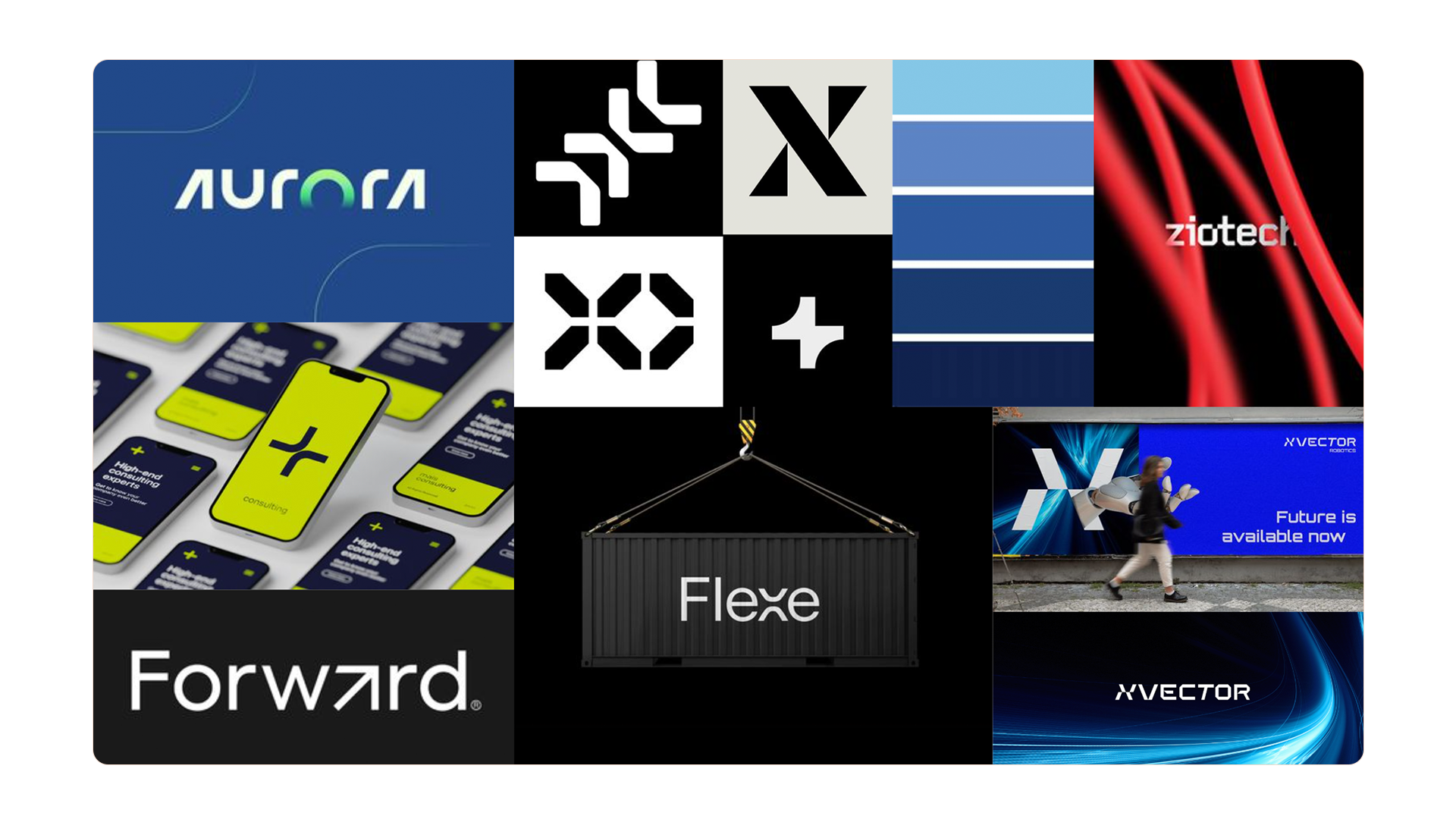
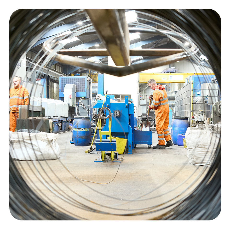
Nexus Wire & Consumables
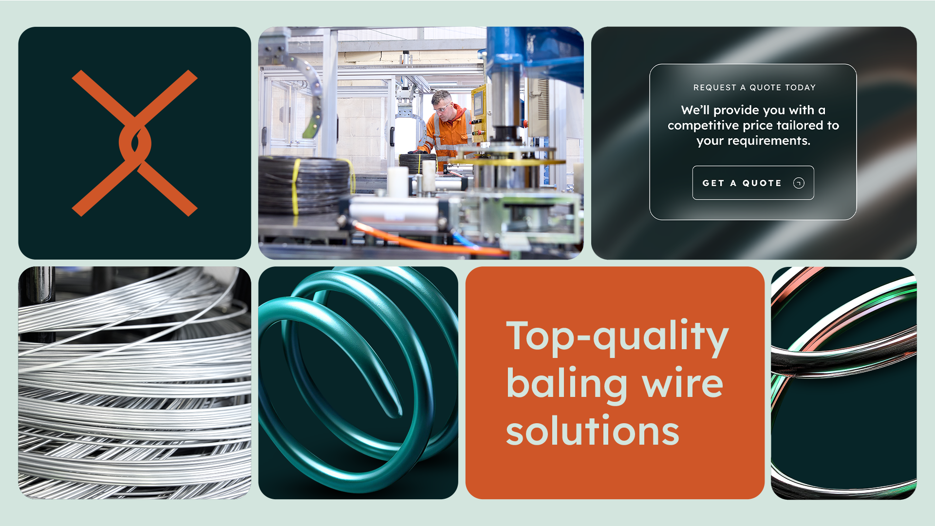
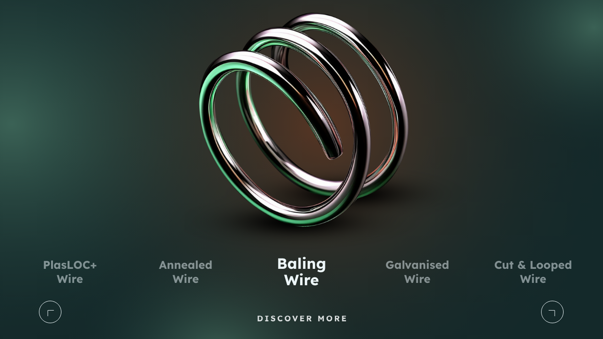
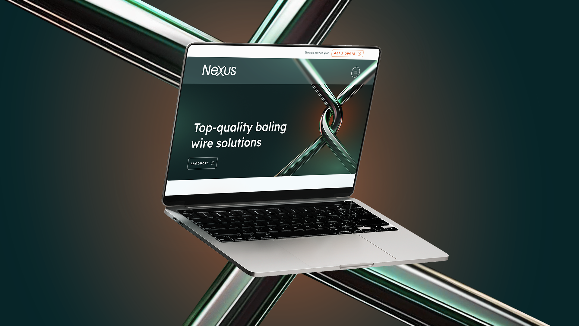
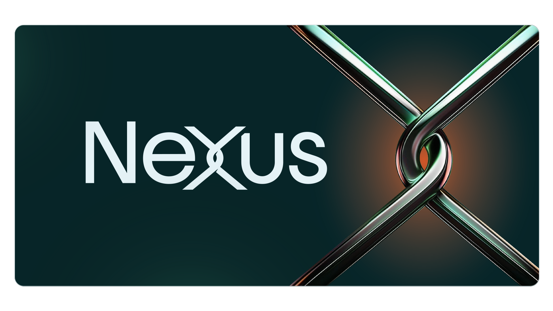
The branding features a distinctive wordmark with a custom-designed ‘X’ icon, symbolising the cut and looped wire process. This abstract yet recognisable element creates a modern, futuristic feel and presents the brand in a better light when compared to competitors. A green and orange colour scheme, accented for impact, enhances visual appeal, while sleek typography and adaptable design elements ensure a cohesive, contemporary identity.
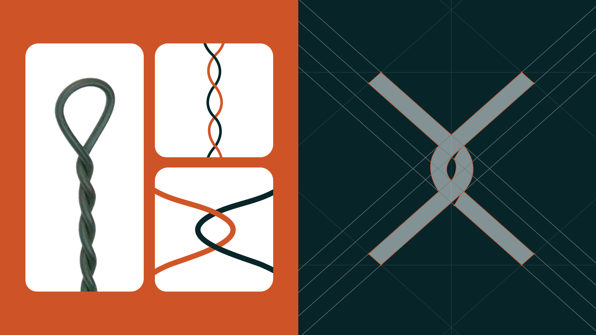
The 'X' icon draws inspiration from the cut and looped wire product, as shown in the image above, reimagined into a simplified, abstract form. The final logo was carefully constructed using a grid system to ensure balance, precision, and visual harmony.